As a big fan of the Eurovision Song Contest, I often use the contest as a platform for developing my skills in design.
I have compiled all Eurovision-related design work into this page and I will update it as I design more concepts related to the contest.
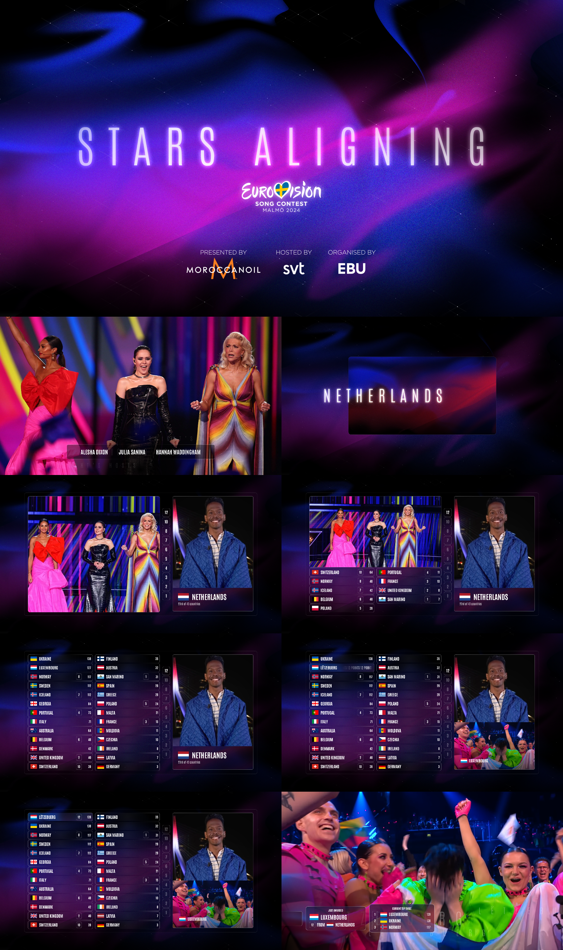
'Stars Aligning' design idea
After Loreen's win in Liverpool (2023), I started experimenting with theme art for the then-upcoming contest in Malmö in 2024. This was my first idea – paying homage to Loreen's second winning song, Tattoo, through those odd and 'unique' slogans they did each year. This idea inspired the entire design concept and the typography.
Designed in Photopea, with the scoreboard & broadcast graphics made in Powerpoint
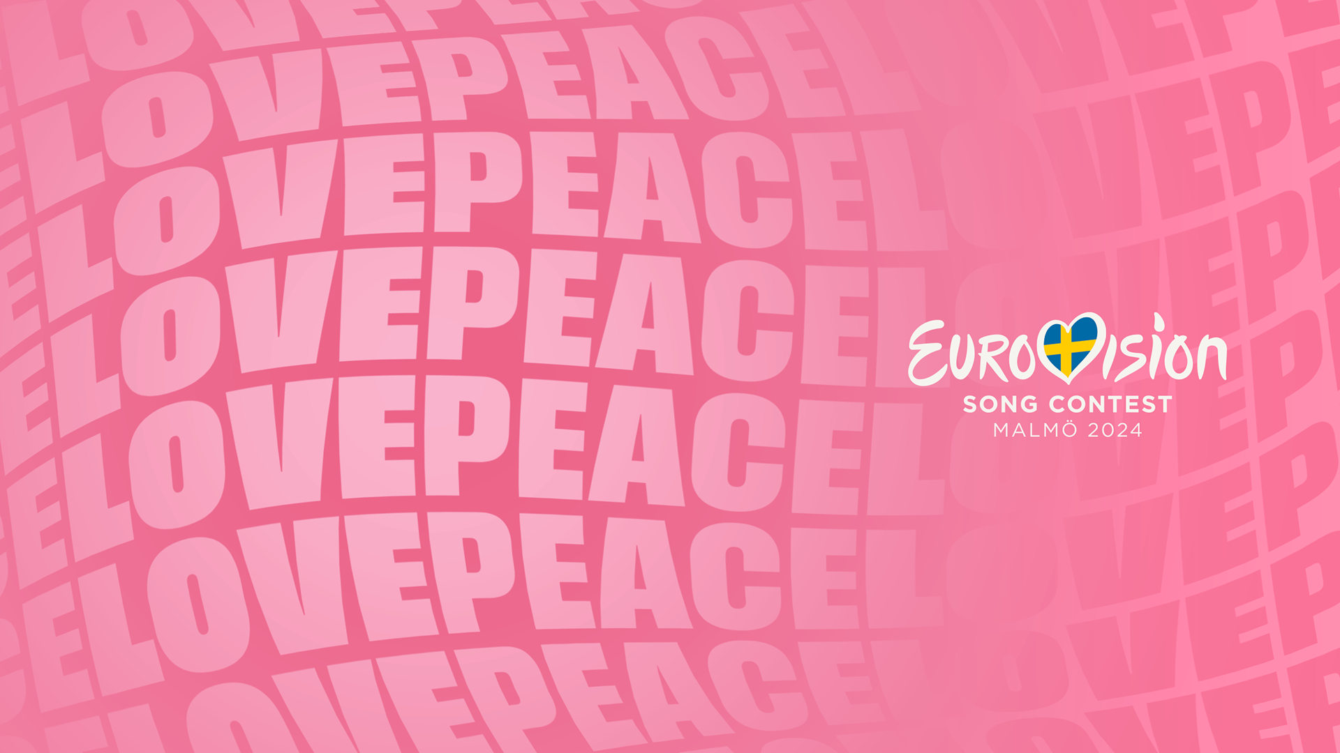
'Love Peace' design: version 1
This was my second idea for the 2024 edition. I decided on the slogan of 'Love Peace' as I thought it followed United By Music nicely, with the same uniting undertone – with a Eurovision reference from Stockholm 2016. And since it was to be held in Sweden, I thought that could be a nice reference. This slogan influenced the colour choices. The design and animation are inspired by heartbeats.
Designed in Photoshop, animated in Davinci Resolve Fusion
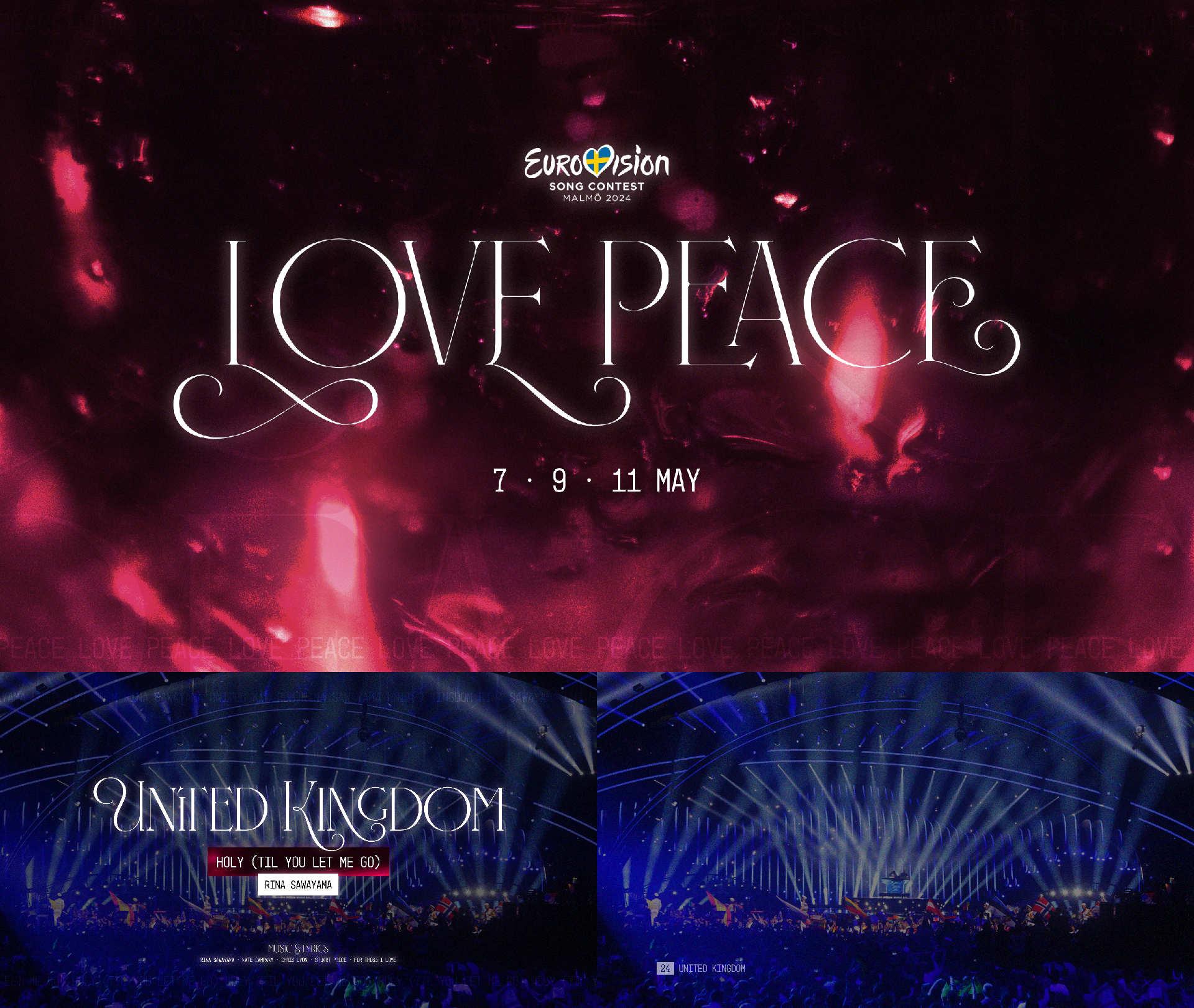
'Love Peace' design: version 2
I reworked this design, keeping the pink colours but instead experimenting with using a photo as a background. The contest doesn't really use photography so much in its branding, so I wanted to experiment with colours and designs based from photos.
Designed in Photoshop
First attempt at redesigning the Eurovision.tv website
In June of 2022, Eurovision.tv was redesigned by a company called Smile. I felt that the design was lazy and unintuitive, making it harder to get to key areas as well as being a UX nightmare. I redesigned it to try and solve these problems. I tried to keep some aspects of their concept – like the heart being intertwined with the carousel at the top, albeit differently.
Designed in Photopea
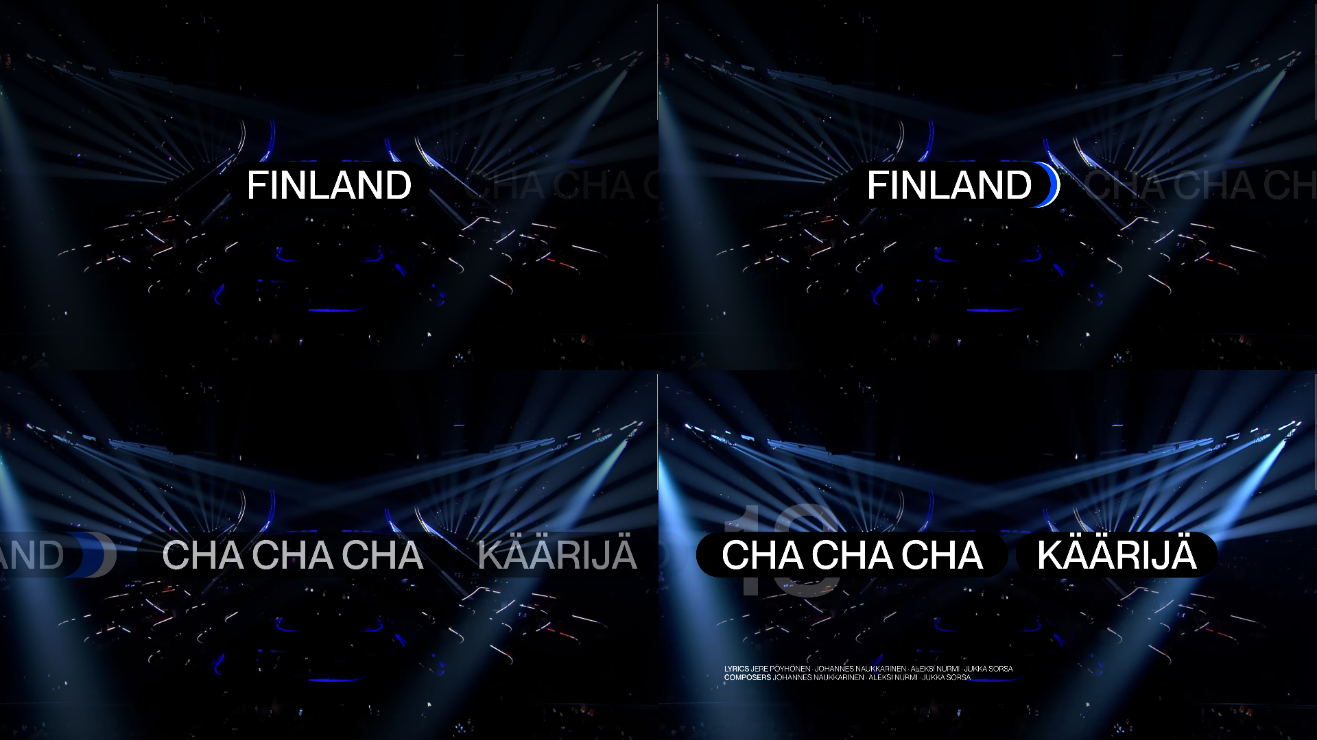
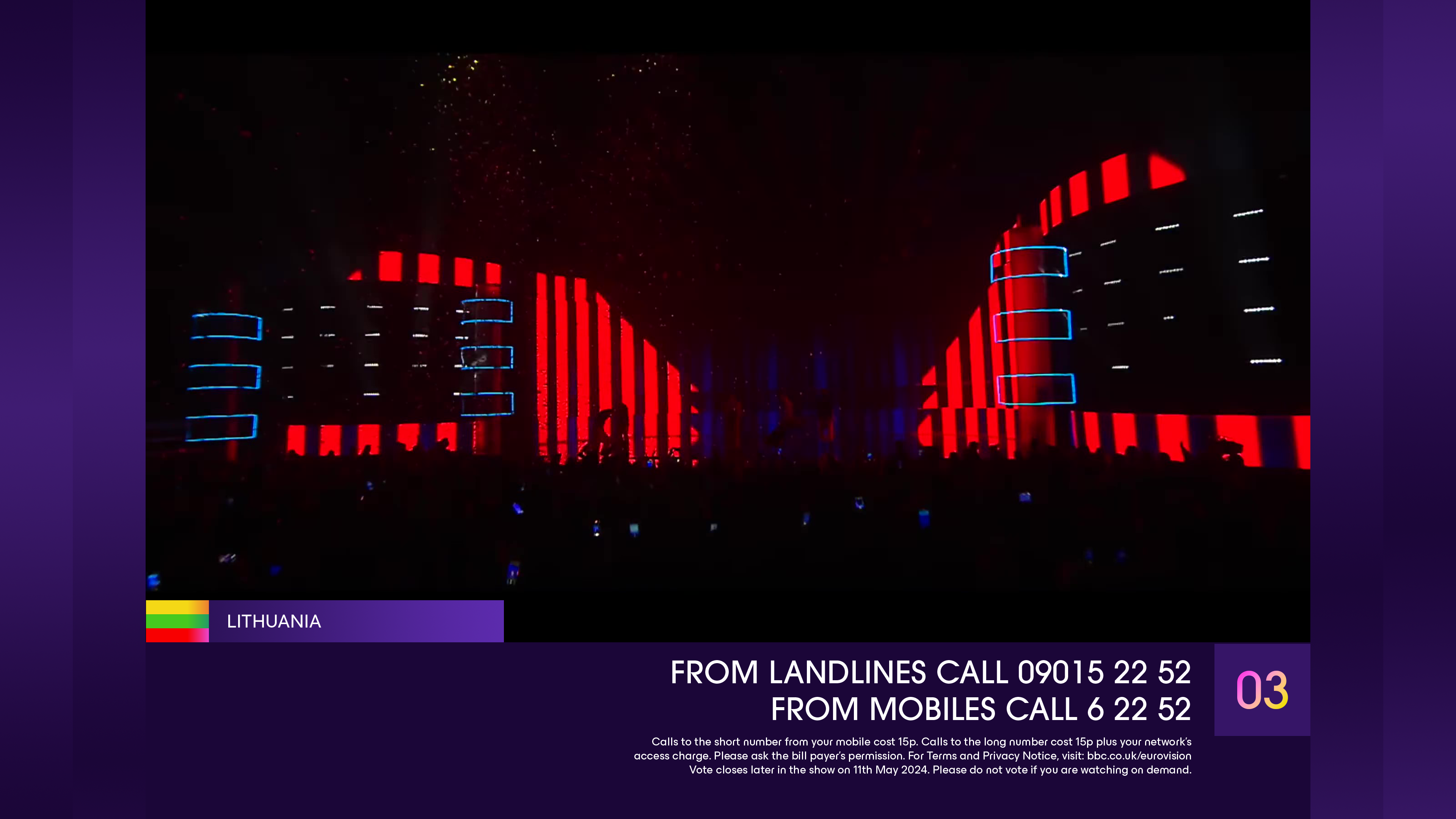
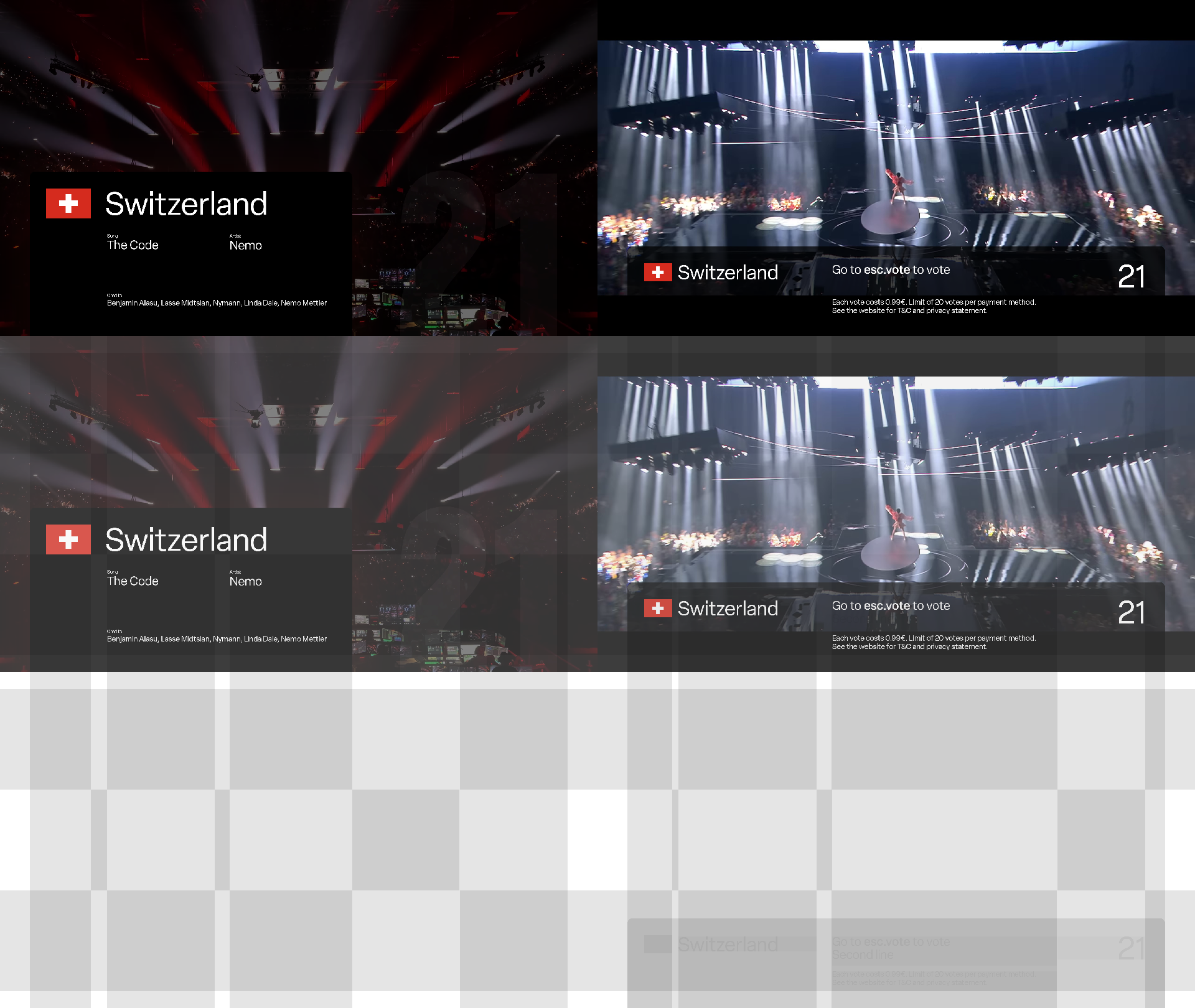
Stage ready animation
At the ESC, before each performance they play a title-card/activation sequence of sorts, and this is colloquially known as the 'Stage ready'. This design was partly inspired by the Eurovision 2023 scoreboard, which had a 'colourful shadow' of sorts beneath each country's name when it moved.
Animated in Davinci Resolve Fusion, concept images for animation designed in Photopea
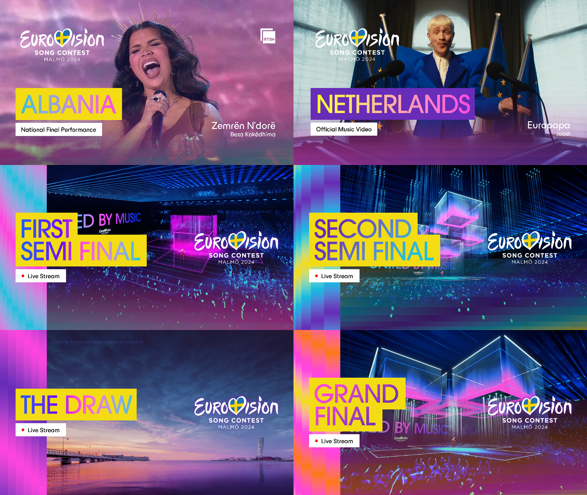
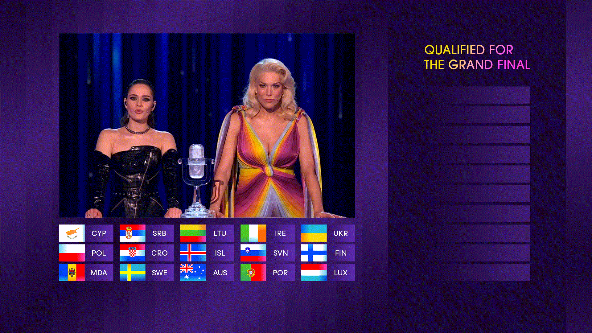
Redesigning the Eurovision 2024 thumbnails
With the 2024 branding revealed, songs being released and videos being uploaded, I felt the social media team's implementation of the theme art into the thumbnails was lazy, and I felt it destroyed the idea of versatility behind the Eurovision Lights concept. I also felt it didn't place enough emphasis on the images of the artists themselves – so I redesigned them.
Designed in Photoshop
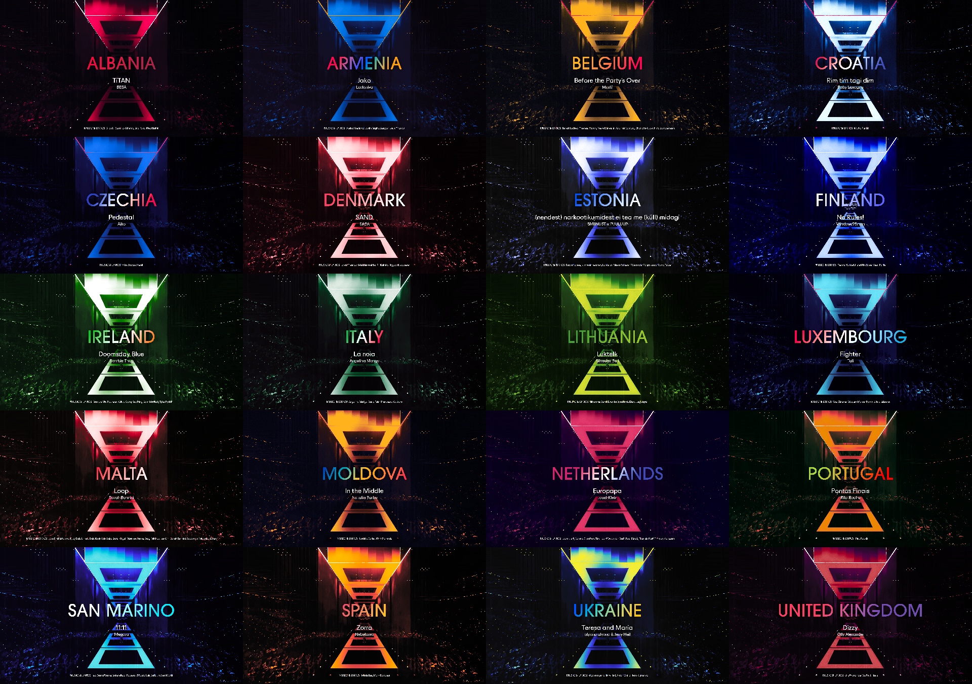
2024 Stage ready designs
The Eurovision Discord take their time to dedicate around 40 days before the contest to each song participating in that year's contest, with some facts and a link to listen to it. To commemorate this, I designed one 'stage ready' design each day for as many countries as possible.
Designed in Photoshop
An animated version, with a different background image
Animated in Davinci Resolve fusion
Transition in the style of the 2024 design
Every year, the Eurovision social media team release a super-cut with all roughly 40 songs competing at the contest. I decided to design and animate a transition between these songs. I was inspired by the animation used in the intro of the Semi Final allocation draw in January.
Designed in Photoshop, recreated and animated in Davinci Resolve Fusion
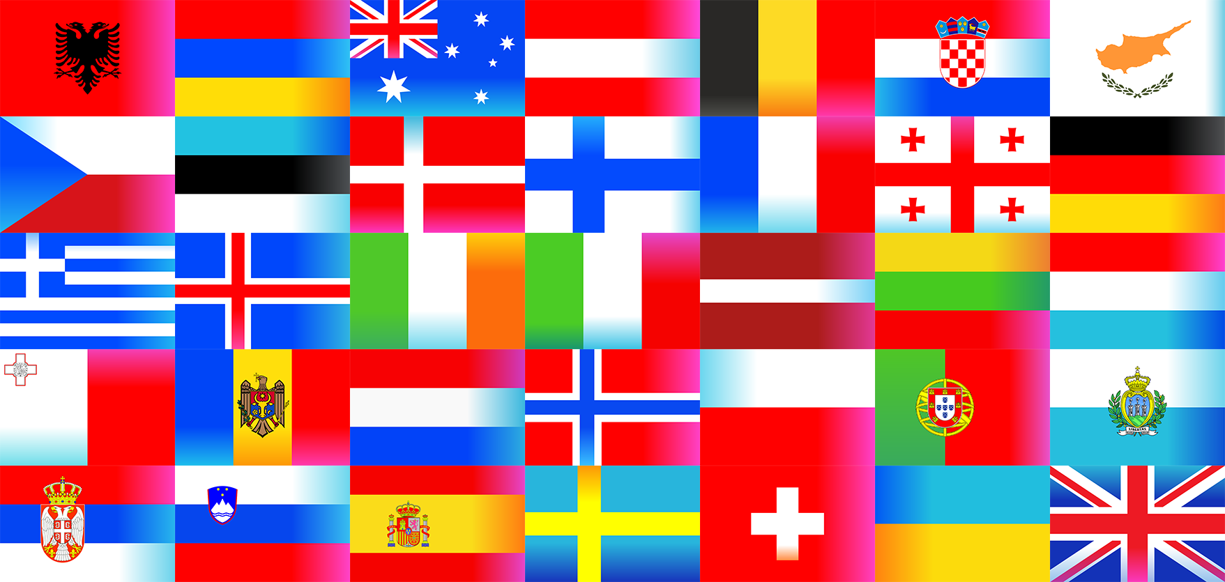
2024 flags design
For the 2024 edition, flags were made for each country, further incorporating the Eurovision Lights concepts into the show. They were used in the Semi Final allocation draw and in the final live shows. I decided to recreate them.
Designed in Inkscape
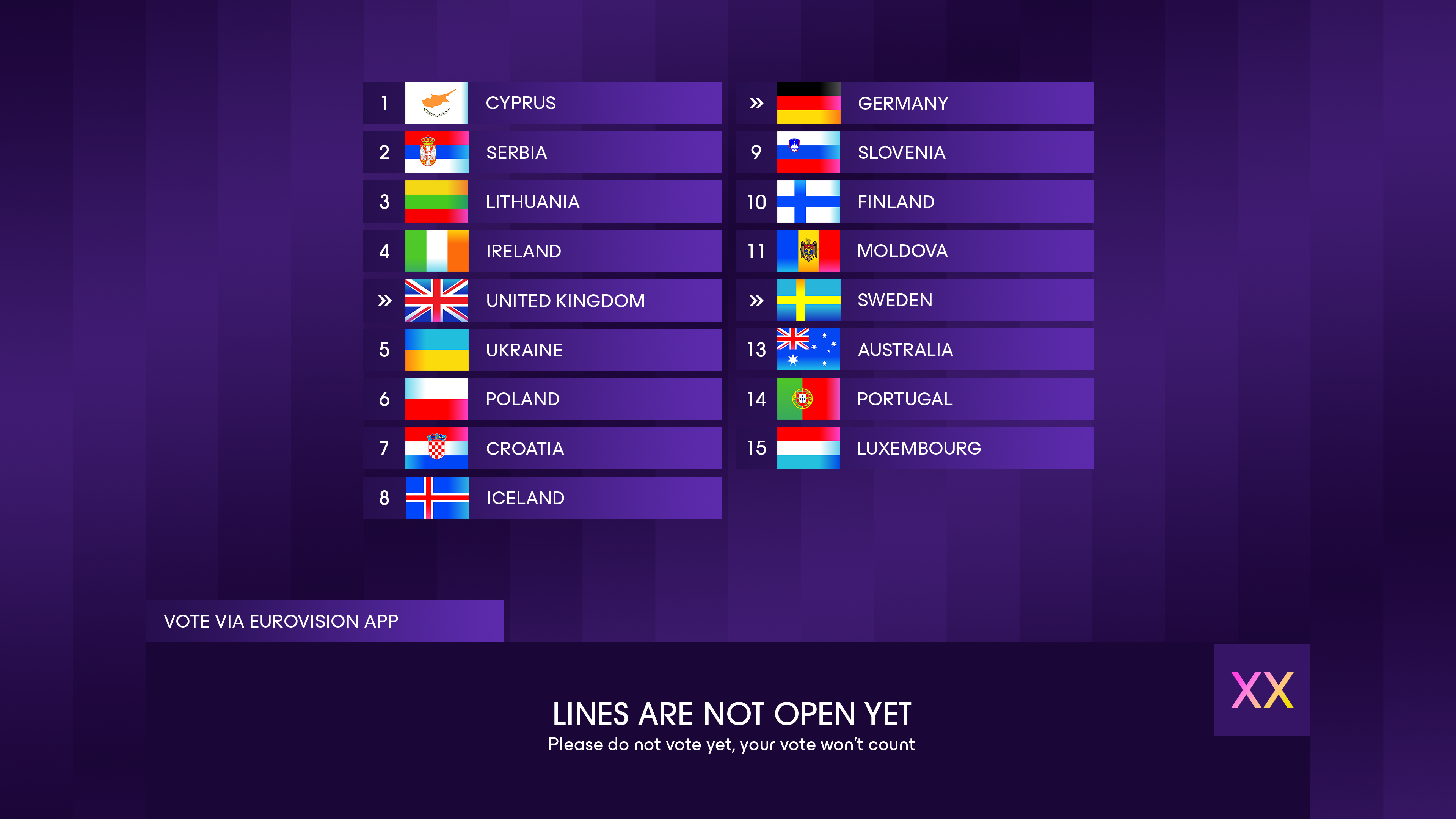
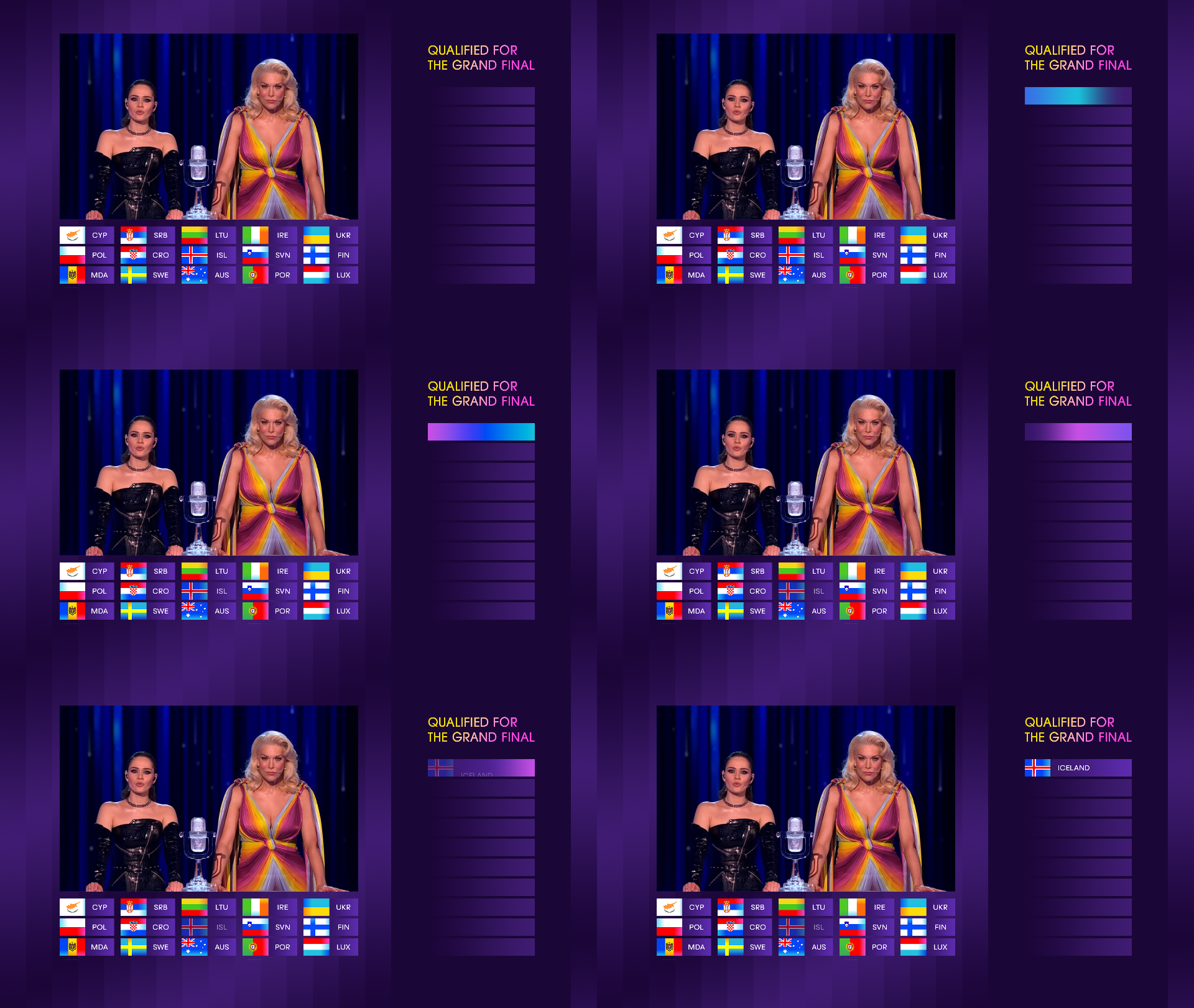
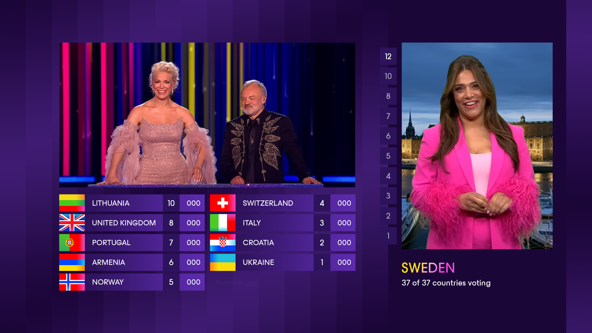
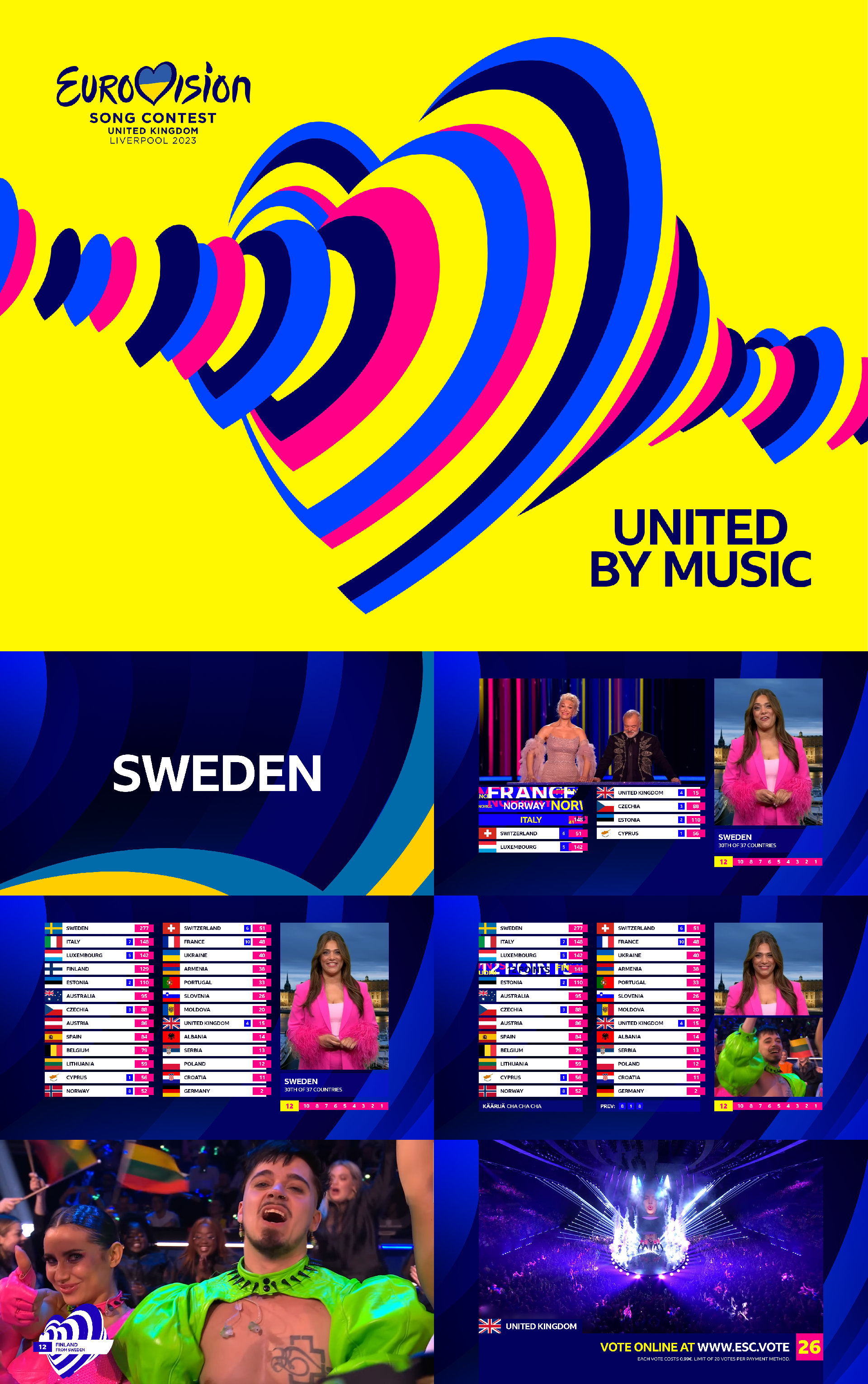
Scoreboard & broadcast graphics ideas
Designed a scoreboard and other related broadcast graphics based on previous graphics for the contest. It turns out they went in a newer direction in 2024, adapting and updating the scoreboard layout and safe areas.
Designed in Photoshop
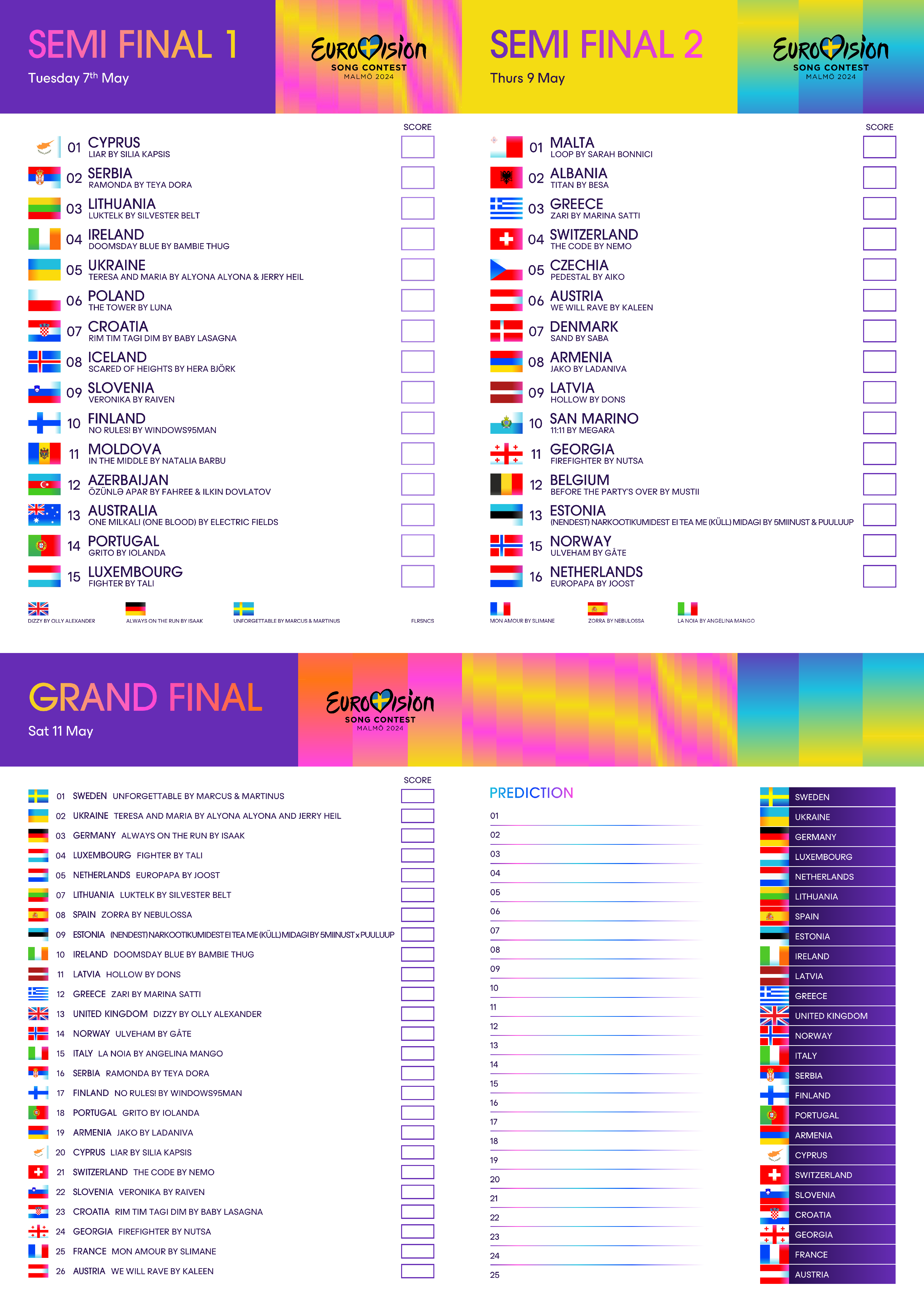
Eurovision 2024 scorecards
I created some scorecards for my family to use during Eurovision.
Designed in Powerpoint
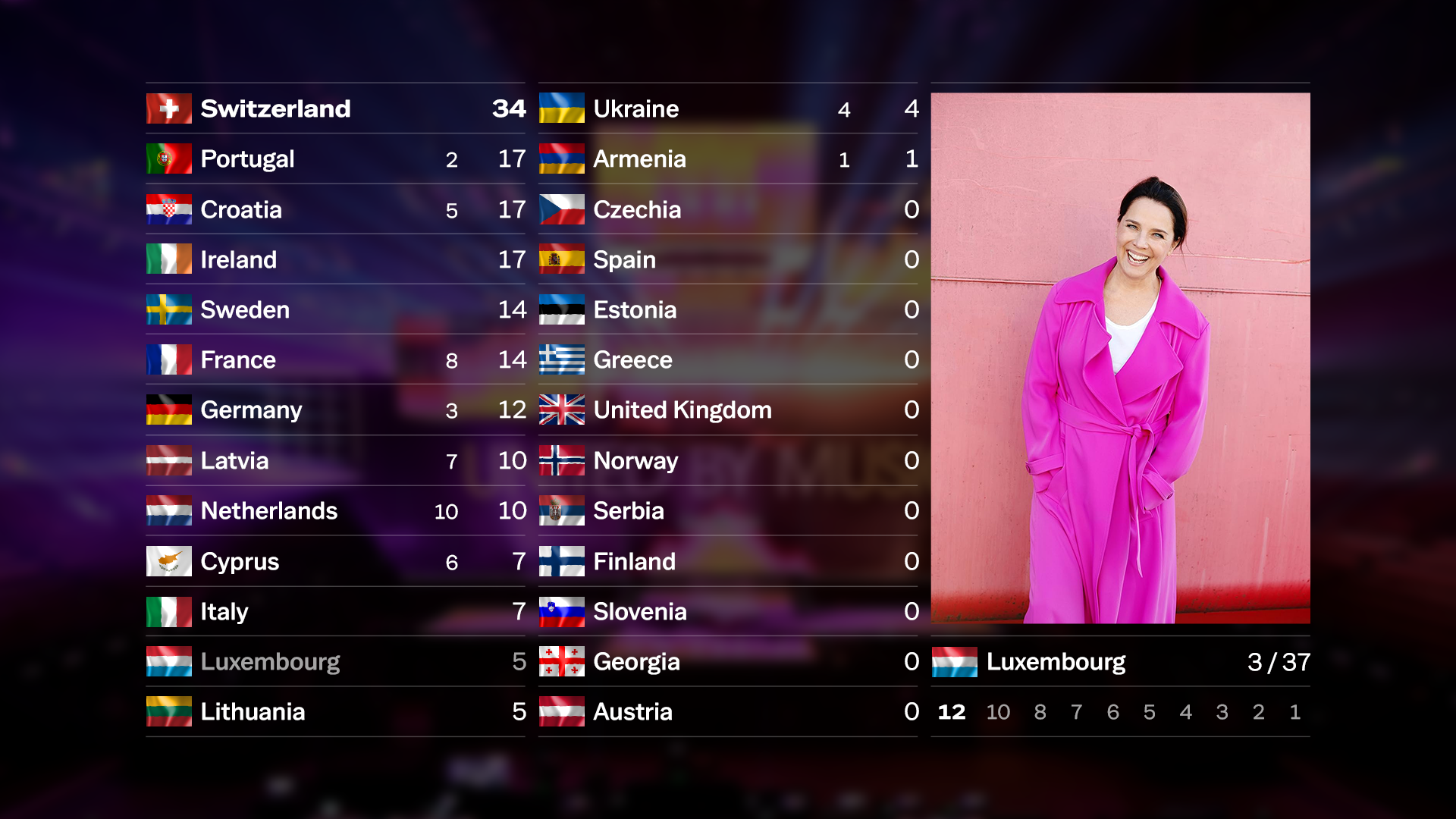
Scoreboard design for 2025
After Switzerland won Eurovision 2024, I started exploring design ideas for the 2025 edition. This is a scoreboard idea.
Designed in Photoshop
Experimenting with different fonts
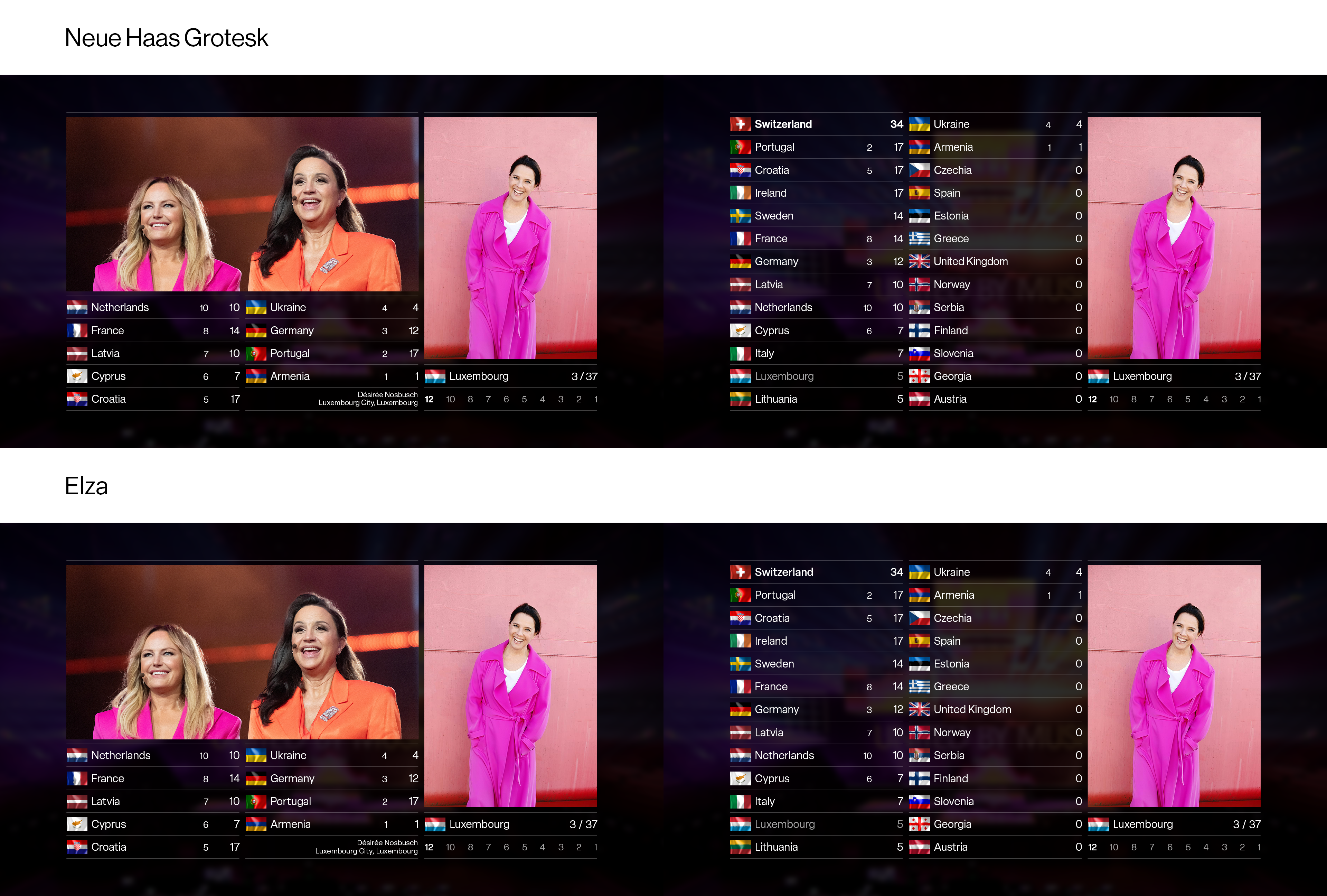
Eurovision 2023 in the BBC font
I wanted to see what it would look like if the BBC had not used Penny Lane, but instead their own font, BBC Reith. I redesigned the scoreboard and voting graphics to see how it would fit in.
Designed in Photoshop & Photopea
Second attempt at redesigning the Eurovision.tv website
This was another attempt at redesigning Eurovision.tv. I further researched the Swiss style to honour the Swiss win in Malmö. It was my first time using Figma to design.
Designed in Figma
2025 stage ready & voting information screen idea
This is a design once again inspired by the Swiss style. I used grids to align everything, and the golden ratio to separate portions of text. It's simplistic as a concept and in its execution, but it does all come together in motion.
Designed in Photoshop, animated in Davinci Resolve Fusion
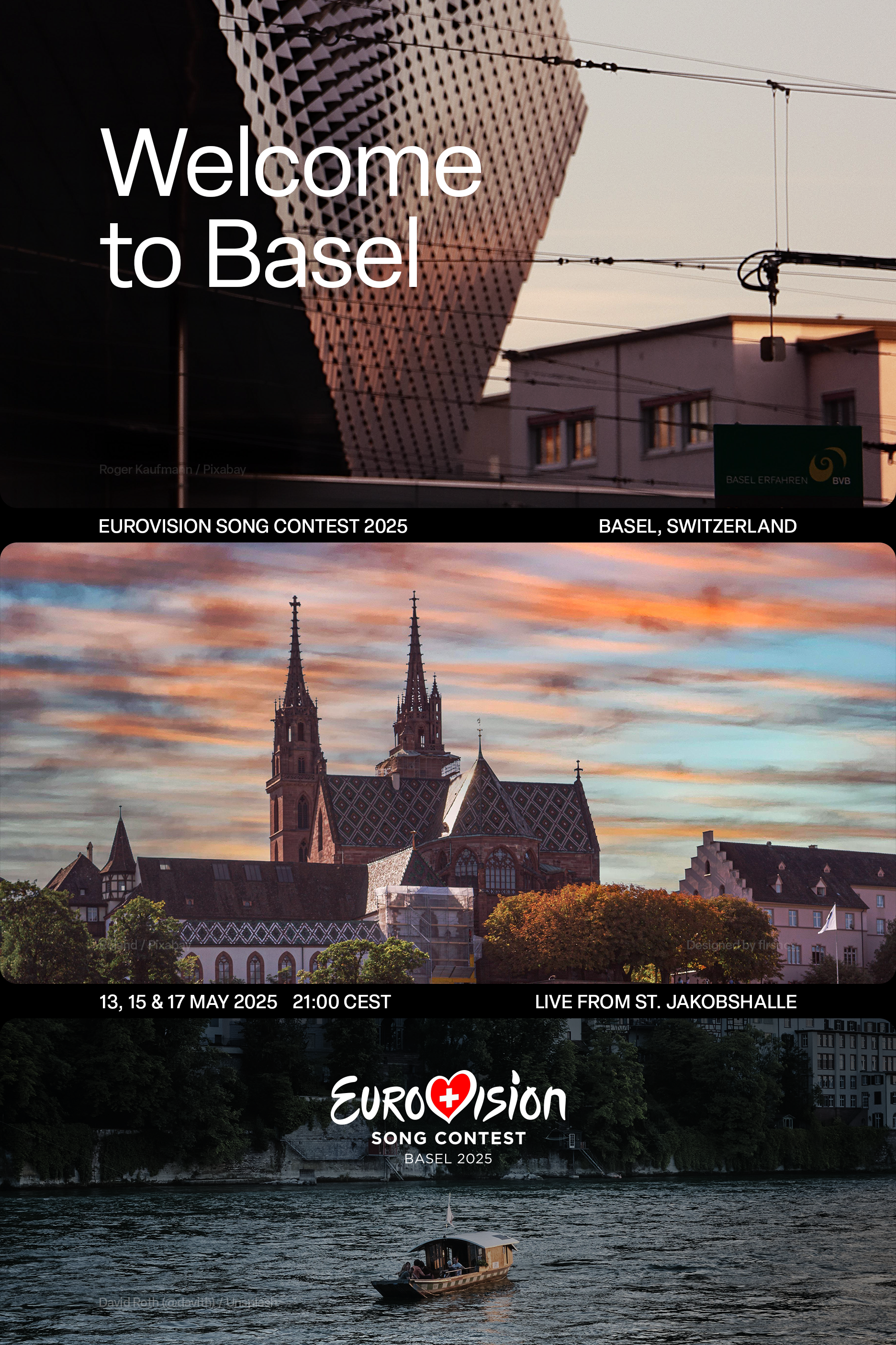
Hastily designed Basel poster
I designed this poster once it was revealed that Basel would be hosting the 2025 contest. This was some more quick experimentation with the Swiss style.
Designed in Photoshop
Further expanding on ideas for 2025
I reworked my stage ready idea and transformed it into a full identity – with a scoreboard and some colour palettes for each country. This takes heavy inspiration from the Swiss flag – with the red, pink and white gradient – and the 2024 branding too.
Designed in Photoshop
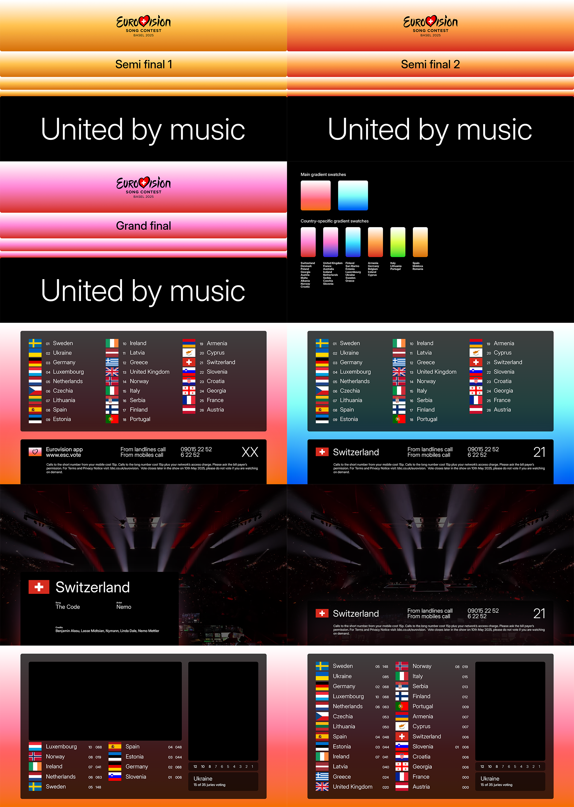
image & video credits: Adam Vaughan/EPA-EFE/Shutterstock, BBC, LRT, SVT, EBU